Freelance Art Director London

Packaging Case Study

Makies Gift Box Packaging

Client: Selfridges, Brand: Makies, Tools: Adobe Photoshop & Illustrator.
Makies packaging visual revealing the inside of the box.

Project Scope:

To create on the shelf packaging for Selfridges Oxford Street, selling an online experience at mymakie.com.

Responsibilities:

To create concepts, cutter guides & print ready designs for a Makies gift set whilst working closely with Riikka Haro (Brand Designer) & Chris Catton (Director of Product).

"How do we sell something in store that begins as a digital experience before becoming a physical product?”. 

A tech start up based in Shoreditch London, Makies are a customisable 3D printed toy that is designed by you. The idea is that you design your unique toy online from thousands of possible outcomes, and Makies will then 3D print and ship it directly to you. It was such a forward thinking idea that Selfridges wanted to sell it in their flagship Oxford Street store in time for christmas. This presented a unique problem - how do you sell a toy that doesn’t yet physically exist?

Early concept sketch.

Photoshoot of various Makie options for marketing material.

Initially we knew the only way we could sell this product was in the form of a redeemable code that worked with the Makie website. Our first challenge was working out how this would sit on a shelf. Although we were completely customising our own retail space, gift cards have to be hung from walls and there was no way to integrate a store gift card with the Makie website. So we simplified the cards to work like scratch cards with randomly generated numbers covered by a silver foil strip. This itself generated its own problems with security and theft, and with no way of tracking which codes were being sold, we realised the gift card would have to be exchanged after a sale.

Early cover and logo concept with overplayed vector artwork.

Printed packaging sleeve ready for die-cut.

With the gift card problems resolved we began to look at packaging solutions. As I was already designing packaging for other Makie products it made sense to keep all of the box shapes similar. This one differed slightly with it having to have a gift card placed into it after sales, so we developed a sleeve to fit over the box which we refined for a snug fit. For the packaging artwork we looked at the existing brand which involved some really cool monochrome illustrations. Although we wanted this product to honour the same look, we also wanted this to be brighter and more appealing to children. I also felt it would be good for the artwork to show a variety of Makie combinations, so a photo shoot was organised and the circle of dolls became a perfect fit for the cover and new logo. The messaging was also really important here too, as this was the first time the product would be seen in a large retailer. After several iterations we settled on "You Create It • We Make It • Worldwide Shipping", which we also repeated throughout the store. The final piece of the puzzle was how the gift card would fit in the box after sale, which is where we developed what we nicknamed "The Wobbler". Inside the box was a small spring with a card circle attached that the sales assistant could clip the gift card into once the product had been purchased.

Makies packaging visual of box open.

To date this project is still a personal favourite of mine - working with a talented team who had different skill sets and solving a problem so unique that Ive not seen before or since. The project on the whole was a great success as Makies were only supposed to be in Selfridges for the 3 month Christmas period, so I was pleasantly surprised to see it was all still in there 18 months later.

Makies packaging visual of box closed.

Testimonial

"Oli was an extremely creative and hard working member of the Makielab team, bringing a steady stream of high class designs and solutions to some really difficult briefs resulting in a range of very exciting new product lines. He was a pleasure to work with and I have continued to work with him on several other projects since." - Chris Catton, Head of Product @ MakieLab.

Makies: https://mymakie.com
Selfridges & Co: http://www.selfridges.com

If you would like to talk more about about how I can help you create a packaging solution for your project, then I'd love to hear from you!

Makies-Packaging-Design.jpg

Branding Case study

designafriend visual identity

Client: Argos, Brand: DesignaFriend, Tools: Adobe Illustrator
DesignaFriend Fonts
Mood board of Fashion Brand research.

Mood board of Fashion Brand research.

Project Scope:

To create and build a brand for a specific target market. To develop style guides that can be applied across various different mediums.

Responsibilities:

To create a visual identity for DesignaFriend including logo design, packaging, print & digital design.

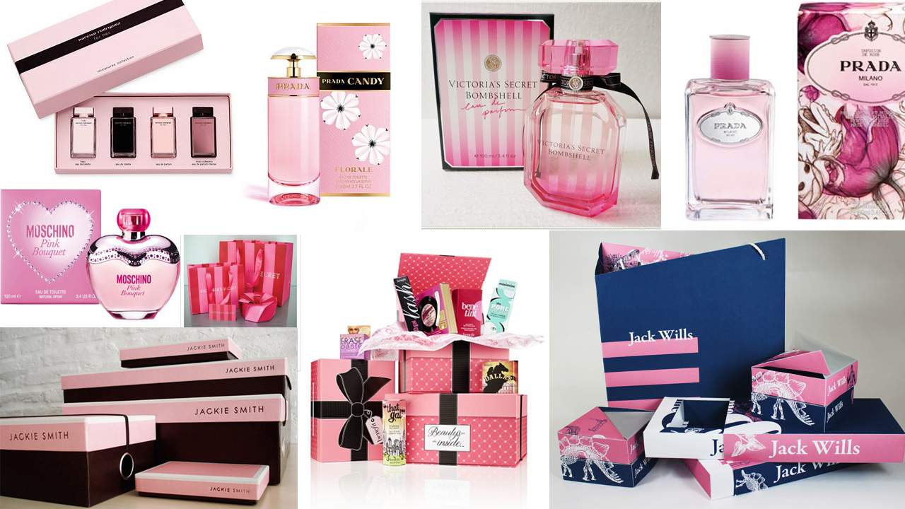
Mood board of Perfume Packaging research.

Mood board of Perfume Packaging research.

"How can we create an identity that appeals to a target market, that in itself aspires to be older than it is?”. 

Kid Kreations are an international children’s toy supplier who specialise in developing own brand products for the UK market. With over 40 years experience in the toy industry alone, the company have developed a wealth of products in various categories including nursery, pre-school, plush, gift and dolls, which they have supplied to major retailers such as Argos, Toys ‘R’ Us, Tesco & Mothercare. After working successfully alongside them on one of their major plush products, I was approached by Kid Kreations to look into branding an exciting new product they were developing called DesignaFriend.

DesignaFriend is an 18” doll that is unique to the UK market. The product teams initial focus was to build a brand that could teach young girls about fashion. Their goal was to create a beautiful product with a variety of different collectible outfits and accessories that could later branch out into fashion design, hair styles & make up. This concept provided me with enough material to begin work on the visual identity, but it also came with a few surprises too.

DesignaFriend Logo Concept #1

DesignaFriend Logo Concept #1

DesignaFriend Logo Concept #2

DesignaFriend Logo Concept #2

DesignaFriend Logo Concept #3

DesignaFriend Logo Concept #3

Whenever I work with clients on branding, I always ask two important questions - “who is the target market?” & “who is the competition?”. The competition part for this was almost null & void as nobody else was really selling this type of product at the time. But answering the target market question is where things started to get interesting. Primarily this product is aimed at girls aged 5-11, but DesignaFriend is not like similar products which model their outfits on what its core age group might wear, infact its outfits were based on what a 16/17 year old might wear. In essence this is reflective of how a 5-11 year old thinks, and it was at this moment that I realised this particular target market is unique - it aspires to be older, and the branding needed to reflect that too.

Primary logo used across all packaging and various marketing material.

Support logo created in 3D for use across catalogue pages & the Argos website.

I began this project by looking into existing fashion brands. I knew the team were wanting something “luxury”, but everything in fashion is pitched at a much older and sophisticated audience that it just didn't translate well to toys. Fashion branding does have its own style though - minimalist type and packaging with more focus on high quality materials rather than artwork. I took this on board and shifted my attention to perfume. Perfume branding has a little more to work with, there are all sorts of different styles that appeal to a variety of different age groups. There is also a wider use of feminine colours which are not seen often in fashion brands as they tend to be mostly gender neutral. Its at this point I began to start mixing styles, taking the minimalist look from fashion & combining it with the stripes and heart shapes found in perfume. The logo itself became a combination of fonts, the word ‘collection’ taking inspiration from the fashion industry, with ‘DesignaFriend’ being styled in something a little more feminine.

It's worth pointing out that when working on a brand like this how important it is to design it 'in context'. Throughout the entire process I was building and testing logos on packaging & catalogue mock ups which I would share with the client for feedback. The main reason for this is to prevent any potential problems further down the line. I can think of numerous examples of logos which look great on their own, but when put into context on packaging or websites don't work at all. In the case of DesignaFriend, two logos have always been used - a primary logo for use on the packaging and in print design, with a 3D secondary logo that sits better on product imagery and online. Since its inception both designs have been rolled out across all packaging, brochures, marketing, digital and print, as well as through various TV campaigns.

DesignaFriend online store on the Argos website.

DesignaFriend launched exclusively in Argos stores nationwide. To date it has sold in excess of £50million, won 3 prestigious awards for brand innovation, and even out sells Barbie. It continues to be the #1 best selling toy in its category.

DesignaFriend packaging visuals in AutoDesk Maya.
DesignaFriend pages in the Argos Catalogue.

DesignaFriend: http://www.argos.co.uk/designafriend
Kid Kreations: http://www.kidkreations.co.uk

If you would like to talk more about about how I can help you create a brand solution for your business or product, then I'd love to hear from you!

Catalogue.jpg